Published: April 2026
Monthly financial reports tell you what happened. Weekly KPI dashboards tell you what is happening. That distinction is the difference between reacting to problems after they have hit your bank account and catching them while you can still do something about it.
Most Australian SMEs review their finances monthly at best, quarterly at worst. By the time you discover that debtor days have blown out, that gross margin has dropped, or that cash is tighter than expected, four to twelve weeks of damage has already been done. A weekly dashboard compresses that feedback loop to days.
This guide covers which KPIs to track, where to source the data, how to build the dashboard, and most importantly, how to turn the numbers into weekly actions.
Monthly reporting has its place. It provides the detailed financial picture (P&L, balance sheet, cash flow) that you need for strategic decisions. But monthly cadence has two weaknesses.
It is backward-looking by definition. Your January P&L lands on your desk by 10 February. You are now making decisions based on data that is 5 to 6 weeks old. In a fast-moving business, that lag matters.
It is too infrequent for course correction. If revenue drops 15 per cent in week one of the month, a weekly dashboard flags it immediately. A monthly report does not surface it until the following month. By then, you have lost four weeks of potential corrective action.
Weekly KPI tracking does not replace monthly reporting. It supplements it with a lightweight, real-time pulse check that takes 15 minutes to review and triggers immediate action when something is off.
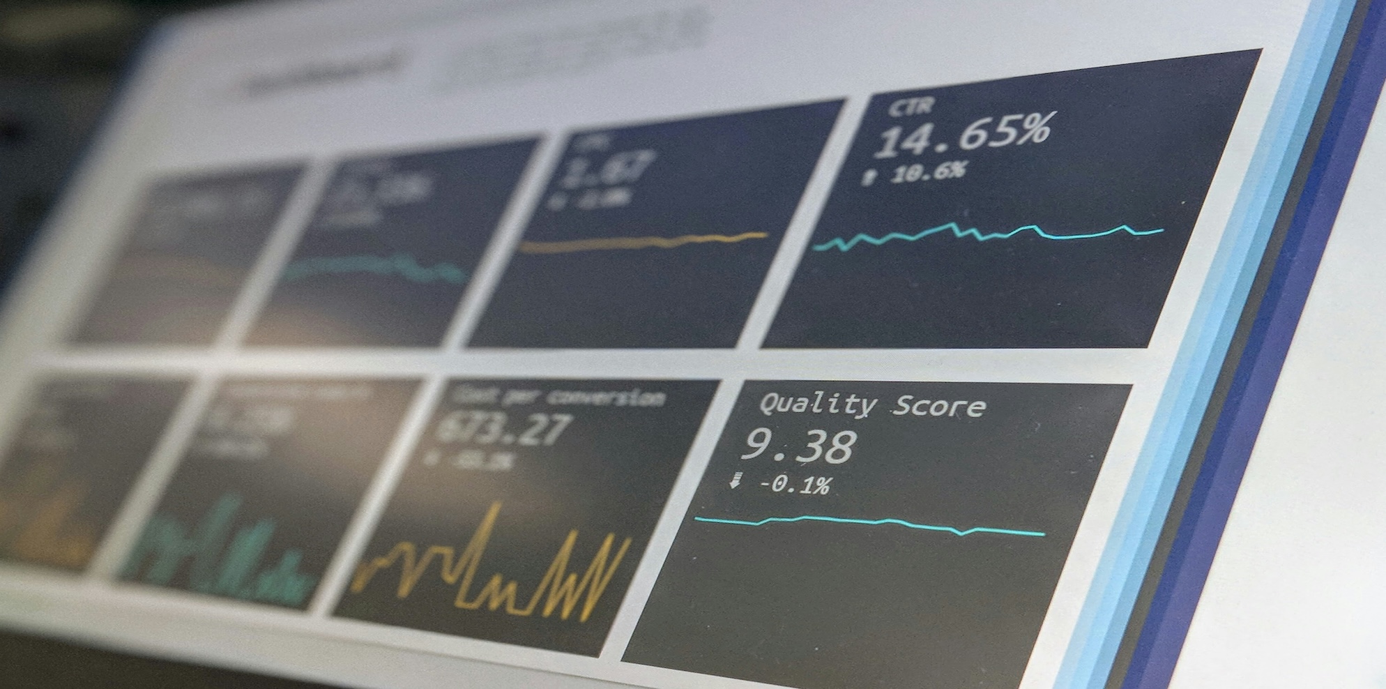
The biggest mistake with KPI dashboards is including too many metrics. More data is not better data. If your dashboard has 25 metrics, nobody will read it. Aim for 8 to 10 KPIs that cover four areas: cash, revenue, operations, and pipeline.
1. Cash in bank (right now). The single most important number in any business. Check it every Monday morning. Not your "available" balance (which might include uncleared deposits). Your actual cleared balance. Source: your bank account or Xero dashboard.
2. Cash runway (weeks). Current cash balance divided by average weekly operating expenses. If the number drops below 8 weeks, you should be actively managing cash. Below 4 weeks is a crisis. Use our how long can we survive calculator to model this.
3. Revenue month-to-date vs target. Where are you sitting against your monthly revenue budget? If you are halfway through the month and at 30 per cent of target, you know there is a problem before the month ends. Source: Xero invoicing report or CRM pipeline.
4. Invoices sent this week. A leading indicator of future cash. If invoicing slows down, cash inflows will follow 30 to 60 days later. Track the number and dollar value of invoices sent each week. Source: Xero accounts receivable.
5. Aged receivables over 30 days. The total dollar value of invoices outstanding beyond 30 days. This is the early warning system for cash flow problems. If this number is growing week over week, your credit control process needs attention. Source: Xero Aged Receivables report.
6. Gross margin month-to-date. Revenue minus direct costs, as a percentage. If gross margin is compressing, you need to know now, not at month-end. A 3 percentage point drop in gross margin on $200,000 monthly revenue is $6,000 less contribution to fixed costs and profit. Source: Xero P&L filtered by direct cost accounts.
7. Payroll as percentage of revenue. Total wages and super divided by total revenue, month-to-date. If this creeps above your industry benchmark (typically 25 to 45 per cent depending on industry), you are either overstaffed relative to revenue or underpricing your services. Source: Xero payroll plus P&L.
8. New leads or enquiries this week. How many new prospects contacted you, booked a call, or submitted an enquiry? This is the earliest leading indicator of future revenue. If lead flow drops for two consecutive weeks, your marketing or outreach needs attention. Source: CRM, website form submissions, or Calendly bookings.
9. Proposals outstanding (number and value). How many active proposals are in play, and what is the total dollar value? This tells you the size of your near-term revenue opportunity. If the pipeline is thin, you need to generate more conversations. Source: CRM or manual tracking.
10. Employee utilisation (services firms only). Billable hours divided by available hours, as a percentage. Target varies by industry (65 to 80 per cent for consulting, 70 to 85 per cent for professional services). If utilisation drops below target, you either have a sales problem (not enough work) or an efficiency problem (too much non-billable time). Source: time tracking software or manual logs.
Put cash metrics at the top. Cash is king and should be the first thing you see. Group remaining metrics by the four areas (cash, revenue, operations, pipeline). For each metric, show: this week's number, last week's number, target, and a status indicator (green/amber/red).
Green: on target or above. No action required.
Amber: within 10 to 15 per cent of target. Monitor closely. If amber persists for two consecutive weeks, escalate to an action item.
Red: more than 15 per cent below target. Requires an immediate action plan this week.
Google Sheets or Excel. The simplest option. Create a single tab with your 8 to 10 KPIs, update manually each Monday. Cost: free. Best for businesses under 15 employees where one person (owner or bookkeeper) updates the numbers.
Xero dashboard. Xero's built-in dashboard provides cash position, invoices owed to you, bills to pay, and a simplified P&L view. Limited customisation but zero setup effort. Useful as a starting point.
Fathom. Connects to Xero and provides visual KPI dashboards with trend analysis, traffic light indicators, and benchmarking. Cost: $50 to $300/month. Best for businesses that want automated dashboards without building spreadsheets. Includes the ability to set KPI targets and receive alerts.
Databox or Klipfolio. More advanced dashboard tools that can pull data from multiple sources (Xero, CRM, Google Analytics). Best for businesses with multiple data systems. Cost: $100 to $300/month.
For most SMEs under $5 million, a Google Sheet updated manually each Monday is the right starting point. Upgrading to Fathom is worthwhile once you have the discipline of weekly review established.
When: Monday morning, before you start the working week.
Who updates: Your bookkeeper, finance team, or office manager. If you are a sole operator, you.
How long: 15 minutes to update, 15 minutes to review. 30 minutes total.
The review process: Look at each metric. Is it green, amber, or red? For any amber or red metric, write down one specific action that will move the number this week. Assign the action to a person with a deadline.
Example: Aged receivables over 30 days is $42,000 (red, target is below $25,000). Action: bookkeeper to call the top three overdue accounts today and send formal payment reminders by end of day Tuesday. Owner to call the largest debtor ($18,000 outstanding) personally.
The accountability framework: At next Monday's review, check whether last week's actions were completed and whether the metric moved. If the metric is still red after two weeks of actions, the problem is structural (not just a follow-up issue) and needs a bigger intervention.
The core 8 to 10 KPIs above work for most businesses. Add one to two industry-specific metrics depending on your sector.
Professional services: add utilisation rate and average hourly rate realised.
Retail: add foot traffic (or website visits), average transaction value, and inventory turnover.
Trades and construction: add jobs in progress, quoted-to-won ratio, and work in progress (WIP) value.
SaaS: add monthly recurring revenue (MRR), churn rate, and customer acquisition cost (CAC).
See our key financial KPIs for Australian SMEs article for a broader set of metrics by industry.
Too many KPIs. If your dashboard has more than 12 metrics, it is a report, not a dashboard. Cut it back to the 8 to 10 that drive decisions.
Tracking lagging indicators only. Revenue and profit are lagging indicators (they tell you what already happened). Leads, proposals, and utilisation are leading indicators (they predict what will happen). You need both. The leading indicators are more actionable because you can influence them this week.
Updating but not acting. A dashboard that gets updated every Monday but never triggers an action is a waste of time. Every amber or red metric must generate a specific action with a specific owner and a specific deadline.
Not reviewing consistently. The value of weekly KPIs comes from the trend, not any single week's snapshot. Two consecutive weeks of declining gross margin is a signal. One week might be noise. You need consistency to see trends.
How many KPIs should be on my dashboard?
Eight to ten. Enough to cover cash, revenue, operations, and pipeline. Few enough that you can review all of them in 15 minutes.
How long does it take to set up a KPI dashboard?
Two to four hours for the initial setup using Google Sheets. Less if you use a tool like Fathom that connects directly to Xero.
Should my team see the dashboard?
Yes. Transparency drives accountability. Share the dashboard with your management team and review it together weekly.
What if I do not have a CRM for pipeline tracking?
Track leads and proposals in a simple spreadsheet. The tool does not matter. The consistency of tracking does.
How do I know if my KPIs are the right ones?
If reviewing a metric does not prompt a potential action, it is the wrong metric. Every KPI should answer the question: "what would I do differently if this number changed?"
What is a good cash runway for an Australian SME?
Twelve or more weeks is comfortable. Eight to twelve weeks is manageable but requires attention. Below eight weeks means cash management should be your top priority every week.
Should I track KPIs weekly or daily?
Weekly for most metrics. Cash position can be checked daily if cash is tight. Revenue and pipeline metrics benefit from weekly cadence. Operational metrics like utilisation may be tracked daily in time-tracking tools but reviewed weekly.
How do I benchmark my KPIs against industry averages?
Xero Small Business Insights provides Australian benchmarks for sales growth, payment times, and cash flow. Fathom includes industry benchmarking in its dashboards. Our financial benchmarks by revenue stage article provides additional reference points.
Start with one KPI this Monday: cash in bank. Check it first thing Monday morning and write the number down. Do it again next Monday. And the Monday after that. Once you have the habit of checking one number weekly, adding the rest of the dashboard is easy. The habit is harder than the spreadsheet.
Scale Suite is a Sydney-based provider of outsourced finance teams and fractional CFO services for Australian SMEs. We deliver weekly bookkeeping, payroll, BAS/IAS lodgement, cashflow reporting, management accounts, and strategic fractional CFO oversight as a fully embedded team that works inside your business.
CA-qualified, Xero Certified, and registered BAS Agents, we replace fragmented bookkeepers and once-a-year accountants with one responsive finance function at a fraction of the cost of full-time hires. We serve growing businesses across Sydney, Melbourne, Brisbane, and Perth, with packages starting from $1,500 per month and no lock-in contracts.
Learn more about our embedded finance model at scalesuite.com.au/services/finance
Disclaimer: This article provides general information only and does not constitute financial, legal, or professional advice. Scale Suite Pty Ltd (ABN 16 684 424 771) recommends seeking advice tailored to your specific circumstances. Liability limited by a scheme approved under professional standards legislation.
Sources
Scale Suite is a Sydney-based provider of outsourced finance and HR services for Australian SMEs. We deliver bookkeeping, financial reporting, payroll processing, fractional CFO support, recruitment, employee onboarding, people and culture support, and fractional HR oversight, all as a fully embedded team that works inside your business.
Employment Hero Gold Partner, CA-qualified, and Xero Certified, we replace fragmented finance and HR processes with one responsive, senior-level function at a fraction of the cost of full-time hires. We serve growing businesses across Sydney, Melbourne, Brisbane, and Perth, with packages starting from $1,500 per month and no lock-in contracts.
30 minutes with our team.
We'll review your current finance setup, compare the full cost of an internal hire against our embedded team, and show you exactly what your finance function should cost at your stage of growth.
You'll leave with a clear view of what's working, what's missing, and where you'd save.
No lock-in contracts. 30-day money-back guarantee.
Prefer to book directly? Grab a time here.